Building foundations for Brighter futures in Jesus’ name
Lola Luz is a Christian ministry working alongside communities in the Dominican Republic to create brighter futures for children and families. Its work reaches across education, nourishment and practical support, with a focus on creating opportunities that can make a meaningful difference over time. At its heart is a belief in walking alongside communities, building strong foundations and helping children feel supported as they learn and grow.
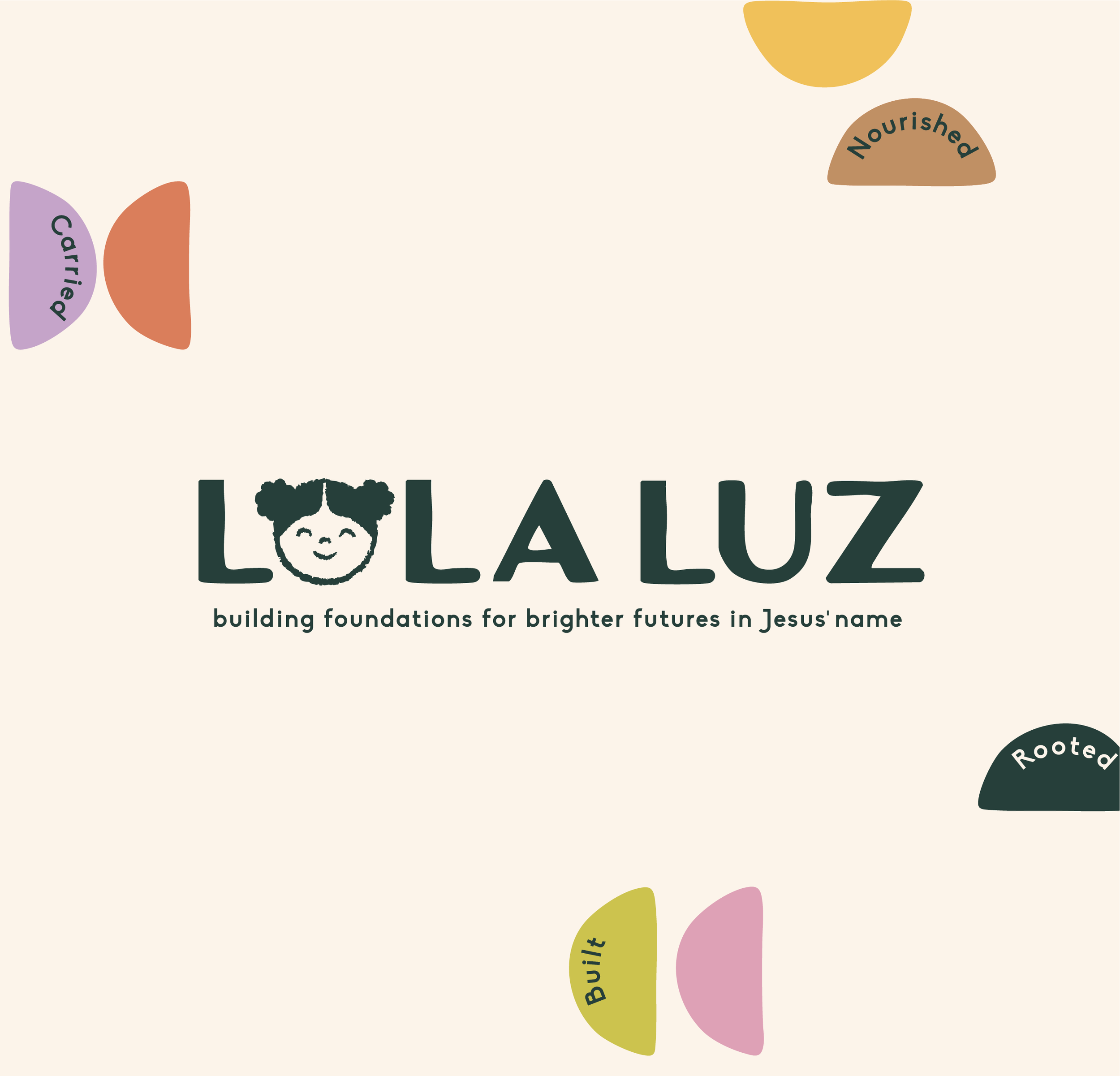
I created a warm, hopeful identity that reflects the heart behind Lola Luz while celebrating the joy and optimism found within the communities it serves. It was important that the brand communicated the significance of the ministry’s work without feeling heavy or defined by hardship. Instead, expressive illustration and thoughtful visual details create a sense of possibility and connection, giving Lola Luz a distinctive identity that feels uplifting, human and full of hope.
Lola Luz
Project Scope: Brand Strategy · Brand Identity · Illustration · Collateral · Social Media Templates

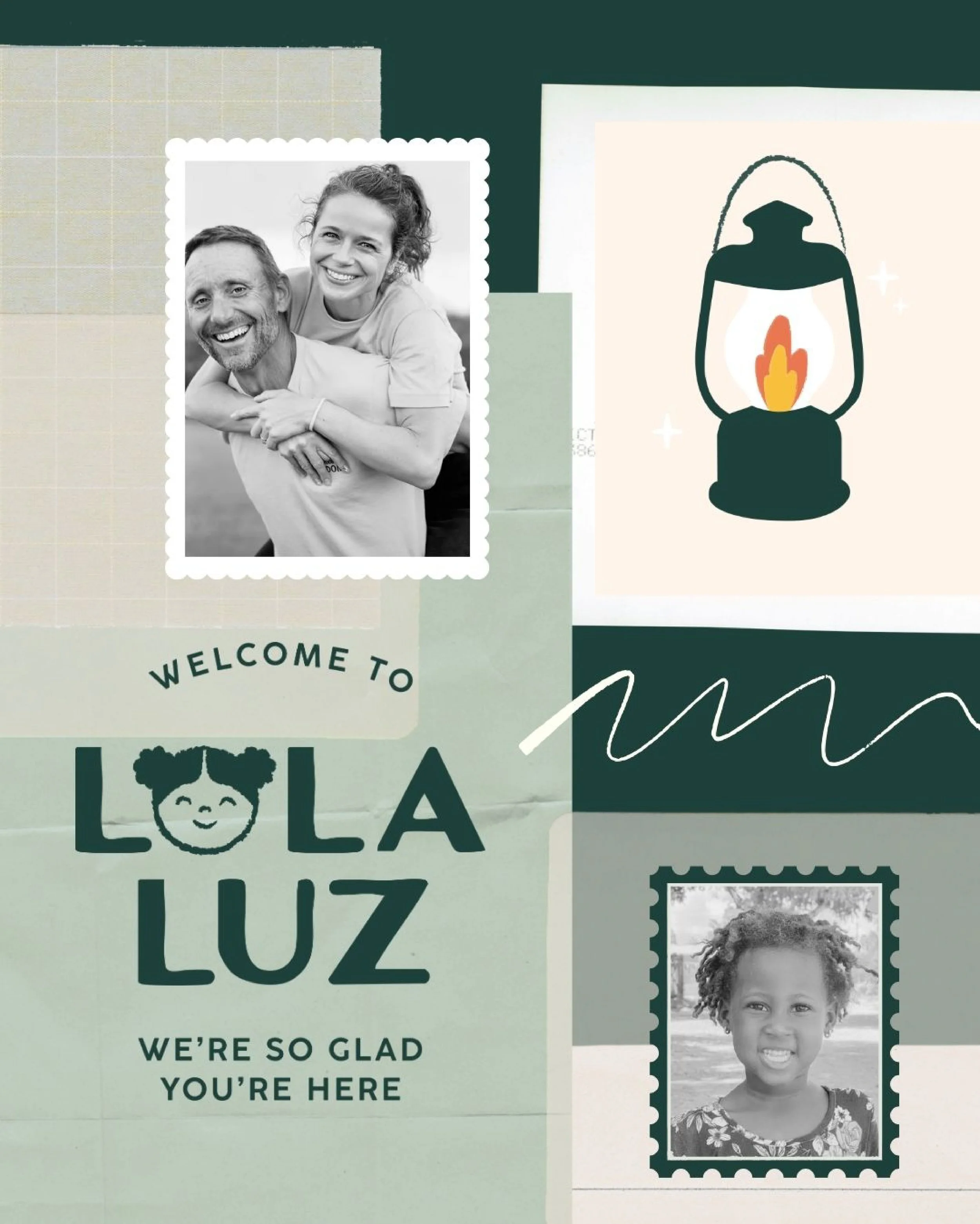
Building strong foundations
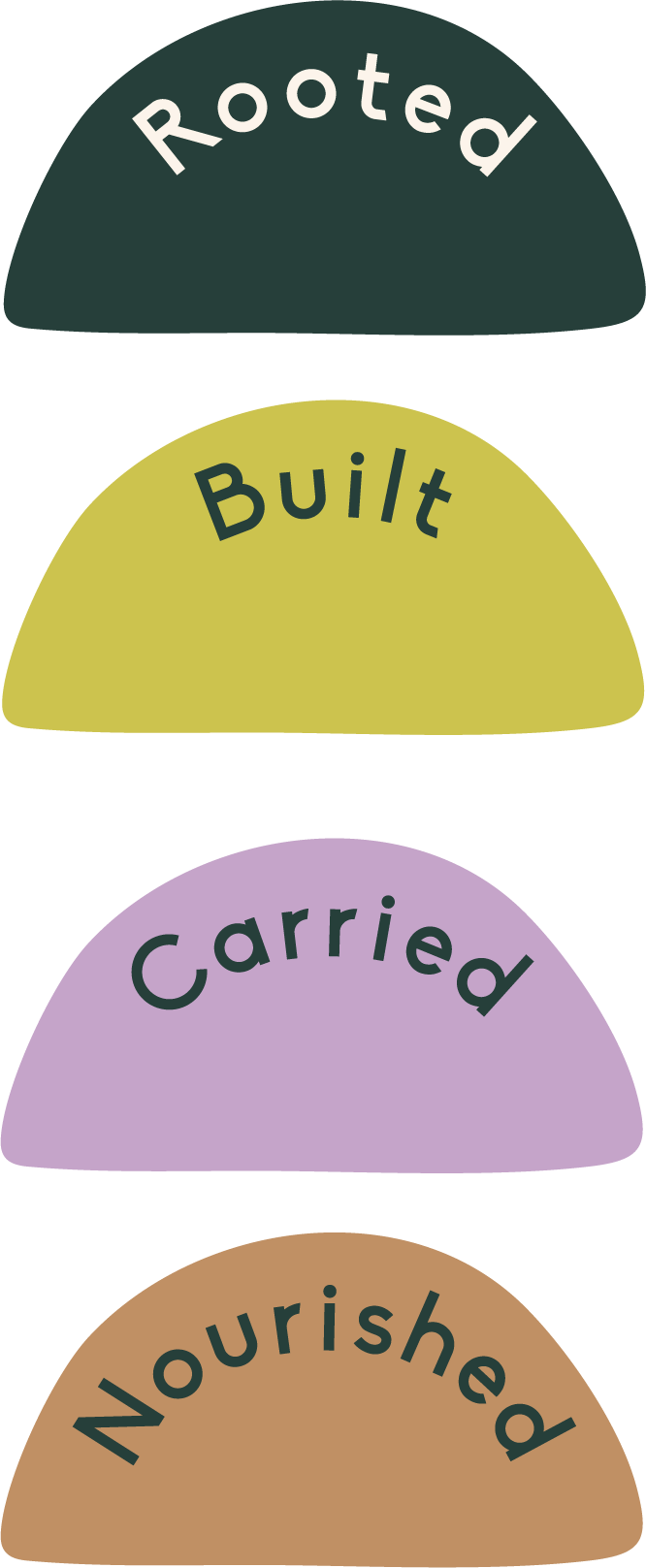
A central part of the strategy was creating the Foundation Framework, a way of bringing the different areas of Lola Luz’s work together under one clear idea. The framework is built around four foundations: Rooted, Carried, Nourished and Built, each representing a different way the ministry supports children and families. Together, they create a clearer picture of Lola Luz’s work and connect everything back to the belief that brighter futures begin with strong foundations.
The framework also gave us a structure that could grow alongside the ministry. Rather than presenting programmes and initiatives as separate pieces, each could sit within a meaningful foundation while remaining part of the wider Lola Luz story. This thinking then informed the visual identity, giving each foundation its own recognisable elements while keeping everything connected through one cohesive brand world.

Kind words from the client
Building the brand
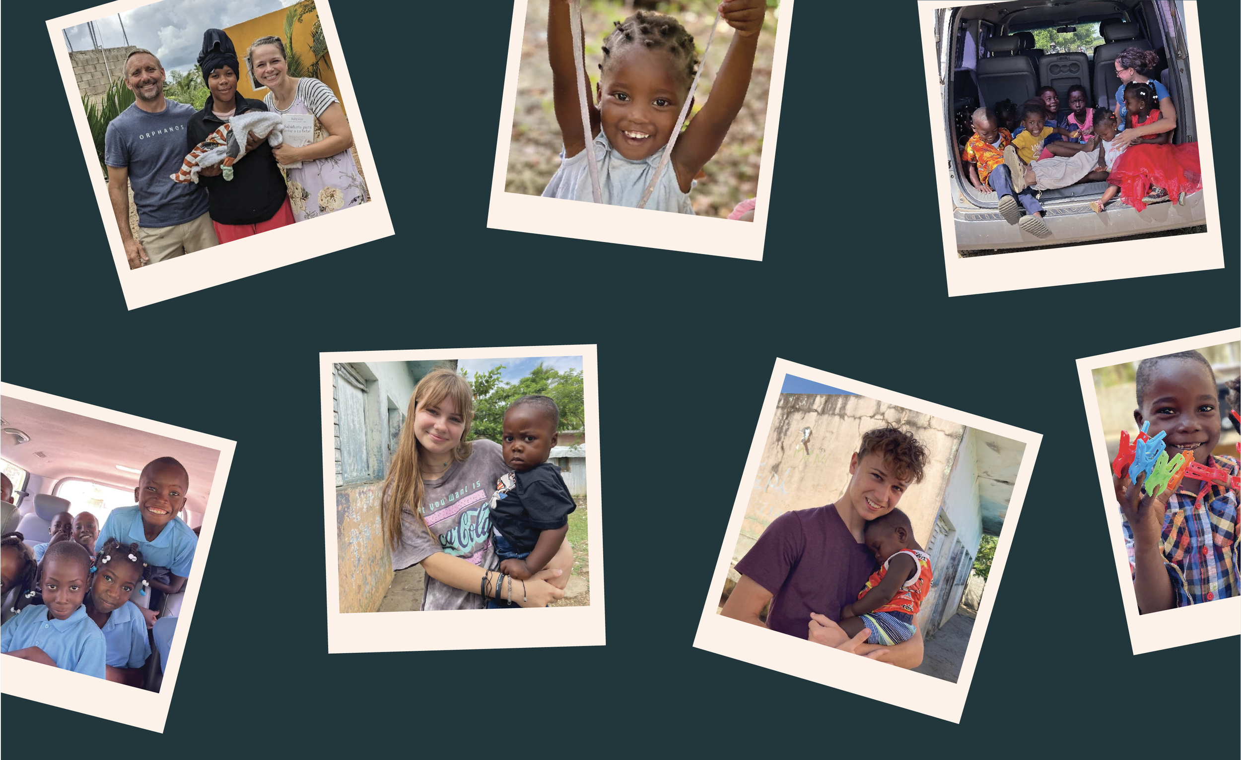
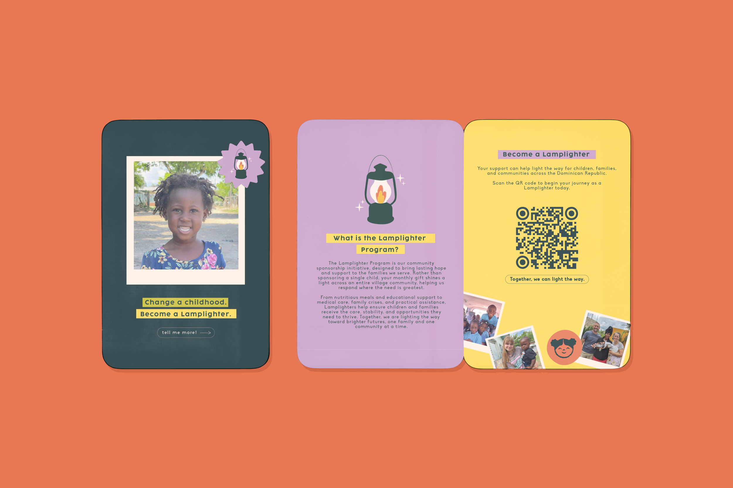
The visual identity was created to feel as hopeful and human as the work Lola Luz does. Warm colour, expressive typography and original illustration give the ministry a distinctive visual language that feels full of life, while still leaving space for the real stories and people at its heart. Rather than relying on traditional charity imagery, the brand focuses on possibility and the brighter future Lola Luz is working towards.
Illustration became an important way to bring the wider story of the ministry to life. Symbols and small illustrated details help communicate different aspects of Lola Luz’s work, while the Foundation Framework creates a thread that connects everything back to Rooted, Carried, Nourished and Built. These elements can move between programmes, campaigns and everyday communications, giving Lola Luz plenty of flexibility without losing that sense of connection to the bigger idea.
The result is a brand that can hold both the purpose behind the ministry and the joy within it. It gives Lola Luz a clear, recognisable way to share its work as the ministry grows, while keeping the people and communities it serves at the centre of the story.