Joyful family living
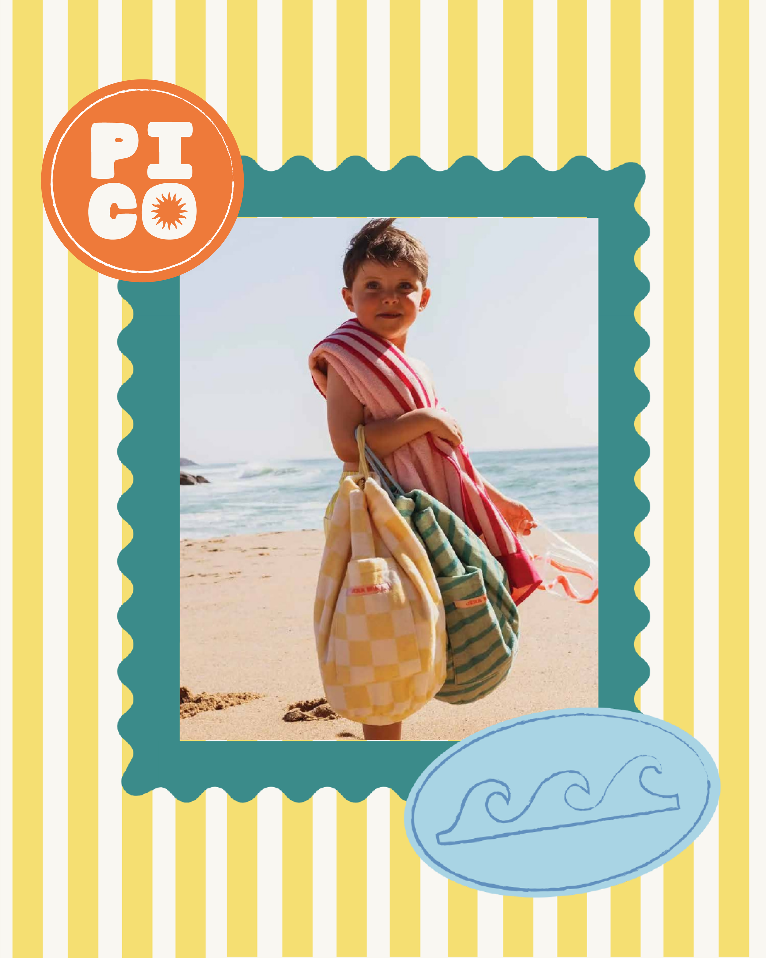
Pico is a joyful family lifestyle brand inspired by sunshine, travel and the colourful moments that make family life memorable. Created as the next chapter of Babyology, the new identity needed to broaden the brand beyond its baby-focused beginnings and create a world that could grow with families, from newborn essentials through childhood and beyond.
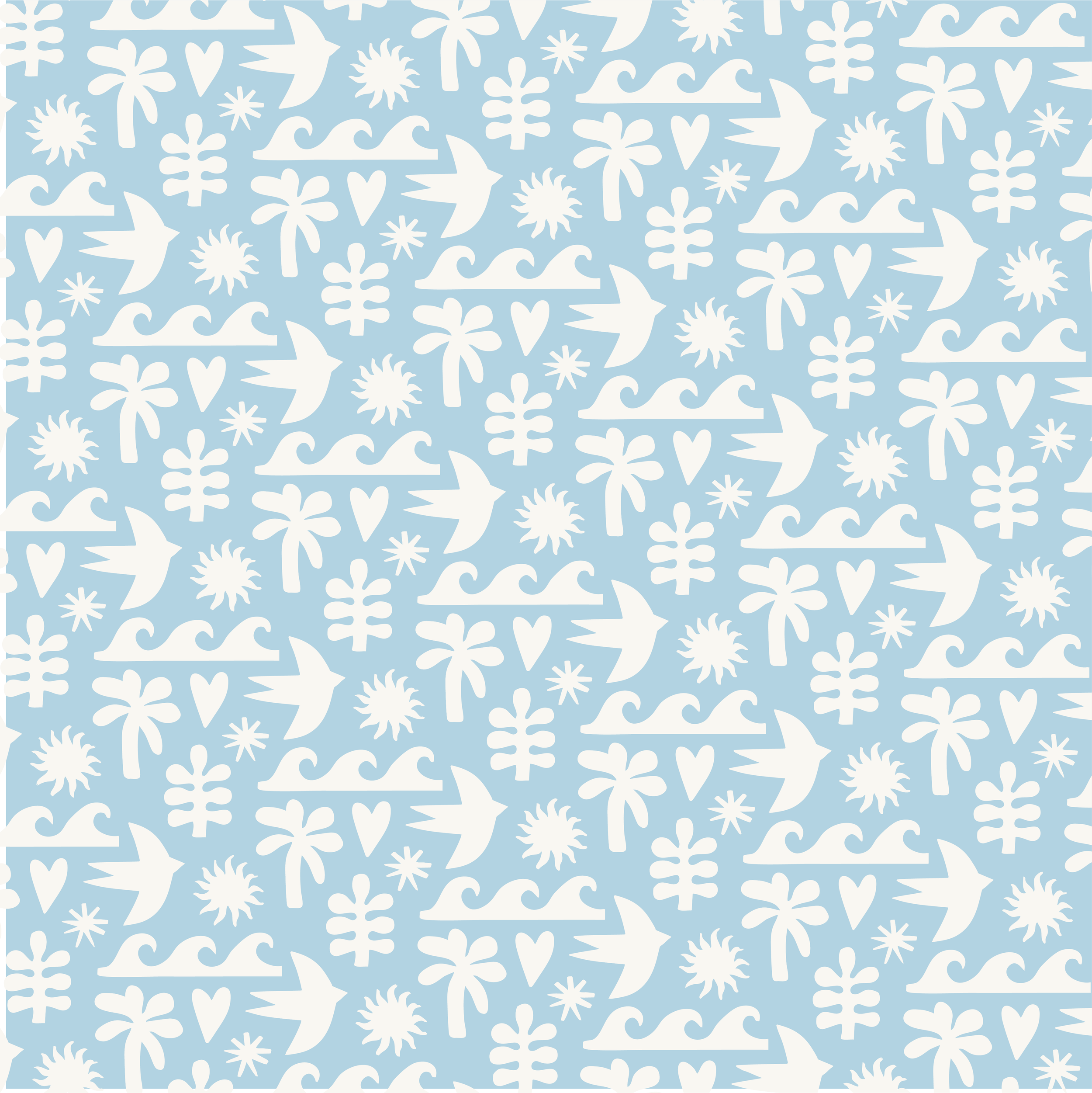
I developed a complete brand identity that brought this wider vision to life, combining strategy, expressive typography, illustration, pattern and a sun-soaked colour palette to create something playful but considered. Inspired by Mediterranean summers, nostalgic holiday moments and the warmth of time spent together, every element was designed to contribute to the same joyful family world, from the flexible logo suite and hand-drawn graphics to the patterns, icons and smaller details that give the identity its character. Together, these elements create a distinctive and adaptable visual language that feels full of energy without becoming overly childish, giving Pico a brand that can connect with families now and continue to grow alongside them in the future.
Pico
Project Scope: Brand Strategy · Brand Identity · Illustration · Packaging

Growing with the families it serves.
As the business evolved beyond its Babyology beginnings, the identity needed to evolve with it. Pico would no longer speak primarily to parents shopping for babies, but to families at many different stages, bringing together thoughtfully curated products, gifting and everyday essentials within one recognisable lifestyle brand.
The challenge was finding the right balance. The identity needed enough colour, energy and personality to feel joyful and family-focused, without becoming overly childish; and enough polish to communicate the considered, curated nature of the products without losing its warmth. This became the foundation for Pico: a brand that feels playful and expressive, but with a clear visual structure holding everything together.
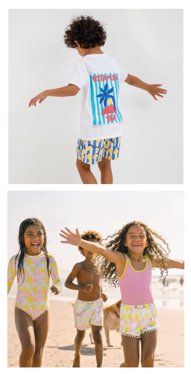

Made for childhood.
Designed with grown-ups in mind
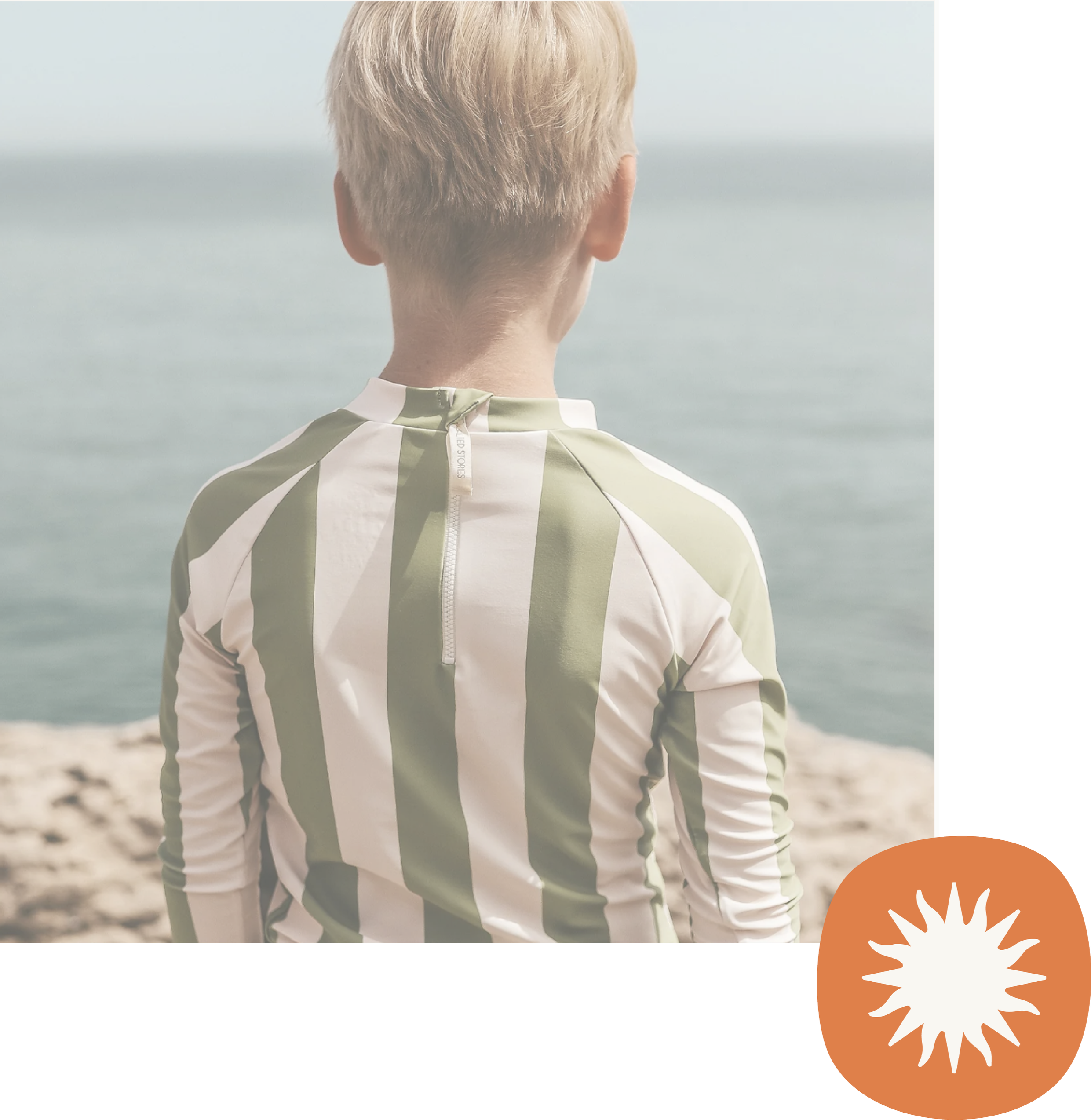
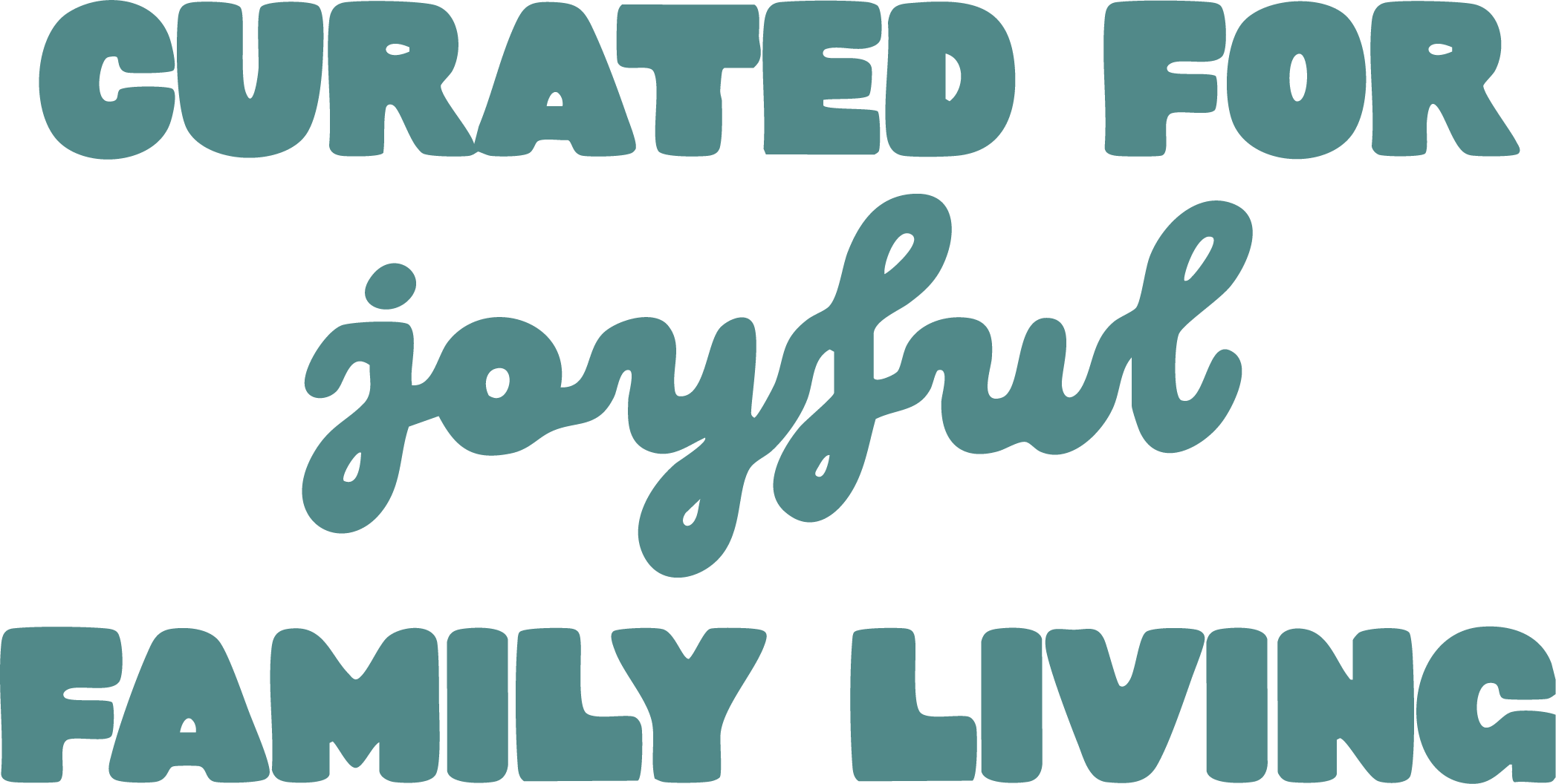

Building the brand
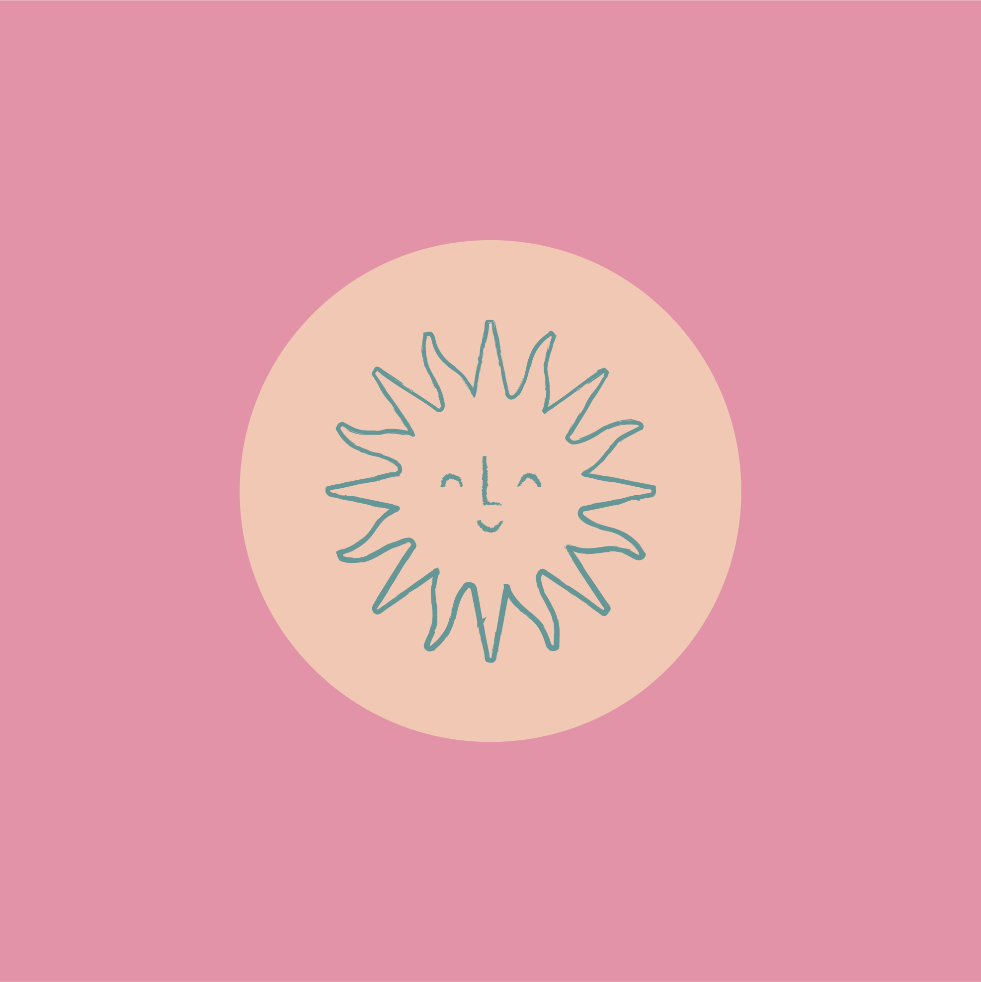
Pico’s identity takes its cues from Mediterranean summers, vintage resort graphics and the nostalgia of family holidays, translated into a visual language of bold typography, hand-drawn illustration, playful pattern and warm, sun-drenched colour. The sun became a recurring symbol throughout the identity, appearing within the logo suite and brandmarks as a simple expression of warmth, optimism and the joyful spirit at the heart of Pico.
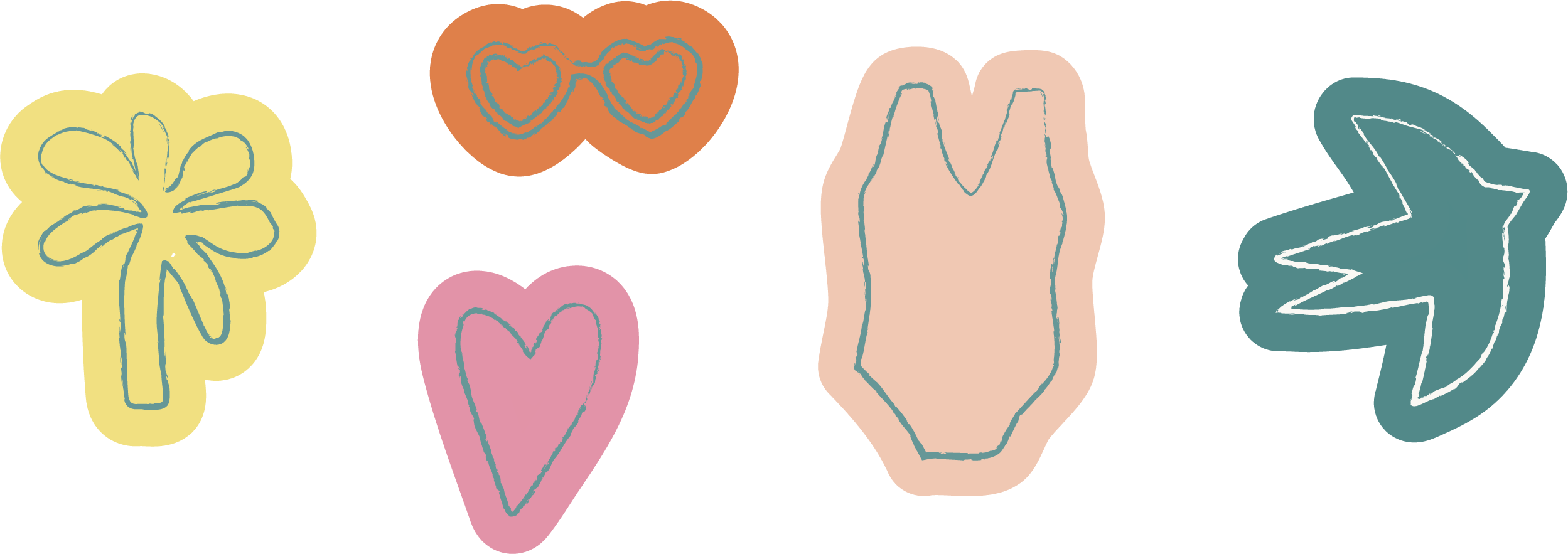
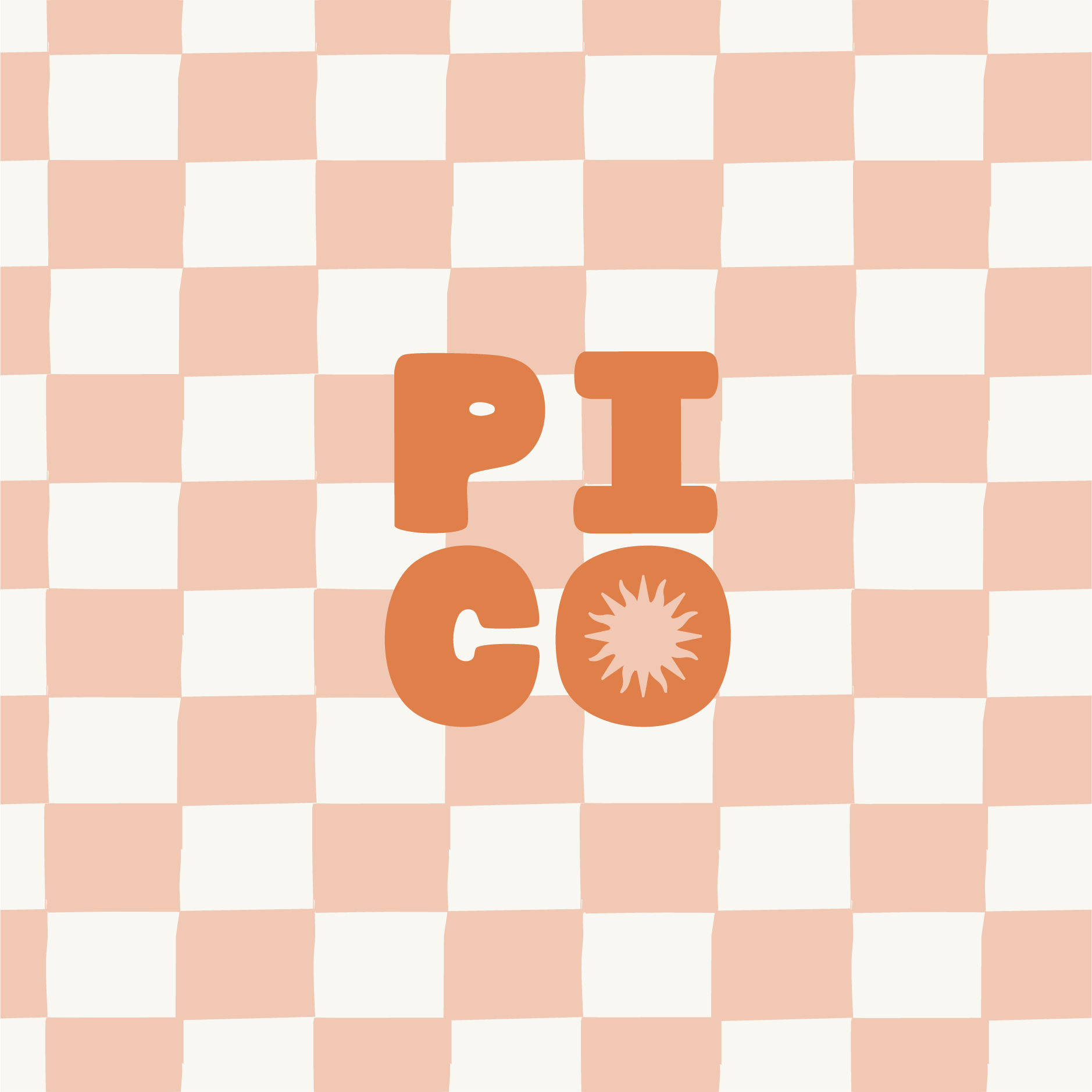
Rather than relying on one logo to do everything, I created a flexible system of logos, symbols, illustrations, icons and patterns that can shift depending on the application while still feeling unmistakably connected. Stripes, checks and expressive motifs bring movement and character; hand-drawn illustrations add a human touch; and the wider colour palette allows Pico to move between playful and more refined moments. Together, these elements give the brand a rich visual toolkit that can stretch across packaging, social media, print and digital touchpoints as Pico continues to grow.