Little clinks, big moments
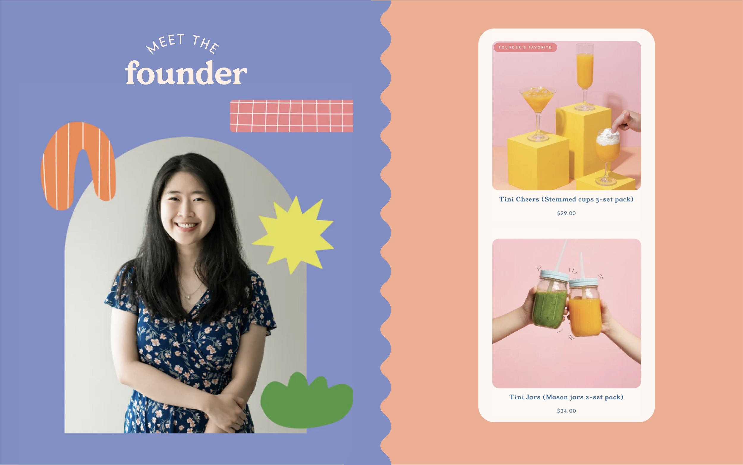
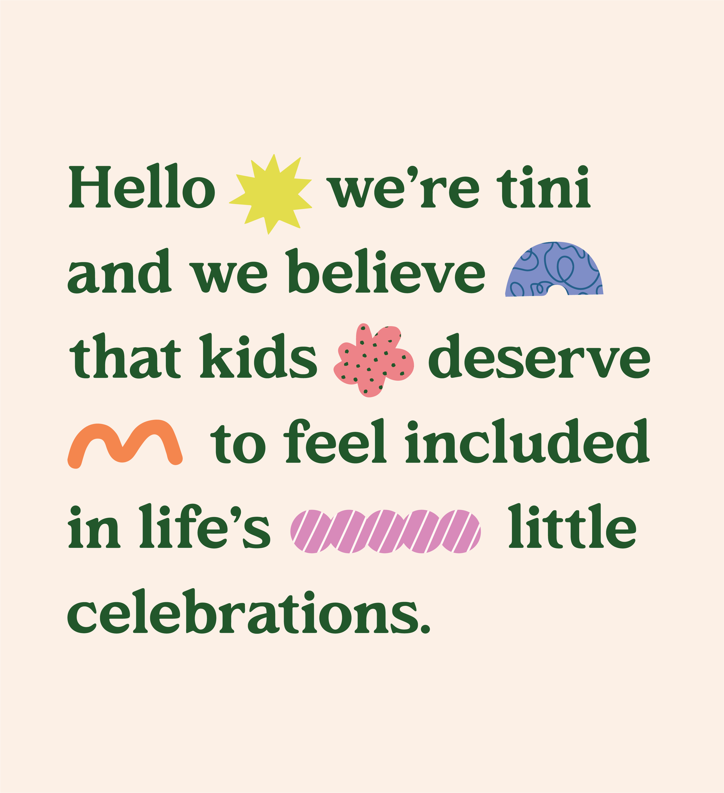
Tini is a children’s drinkware brand created from a simple idea: kids deserve to feel included in life’s little celebrations too. From an everyday breakfast to a birthday toast, so many family moments happen around the table, yet children are often handed something that feels completely separate from the experience. Tini reimagines that with glass-like, unbreakable drinkware made especially for little hands.
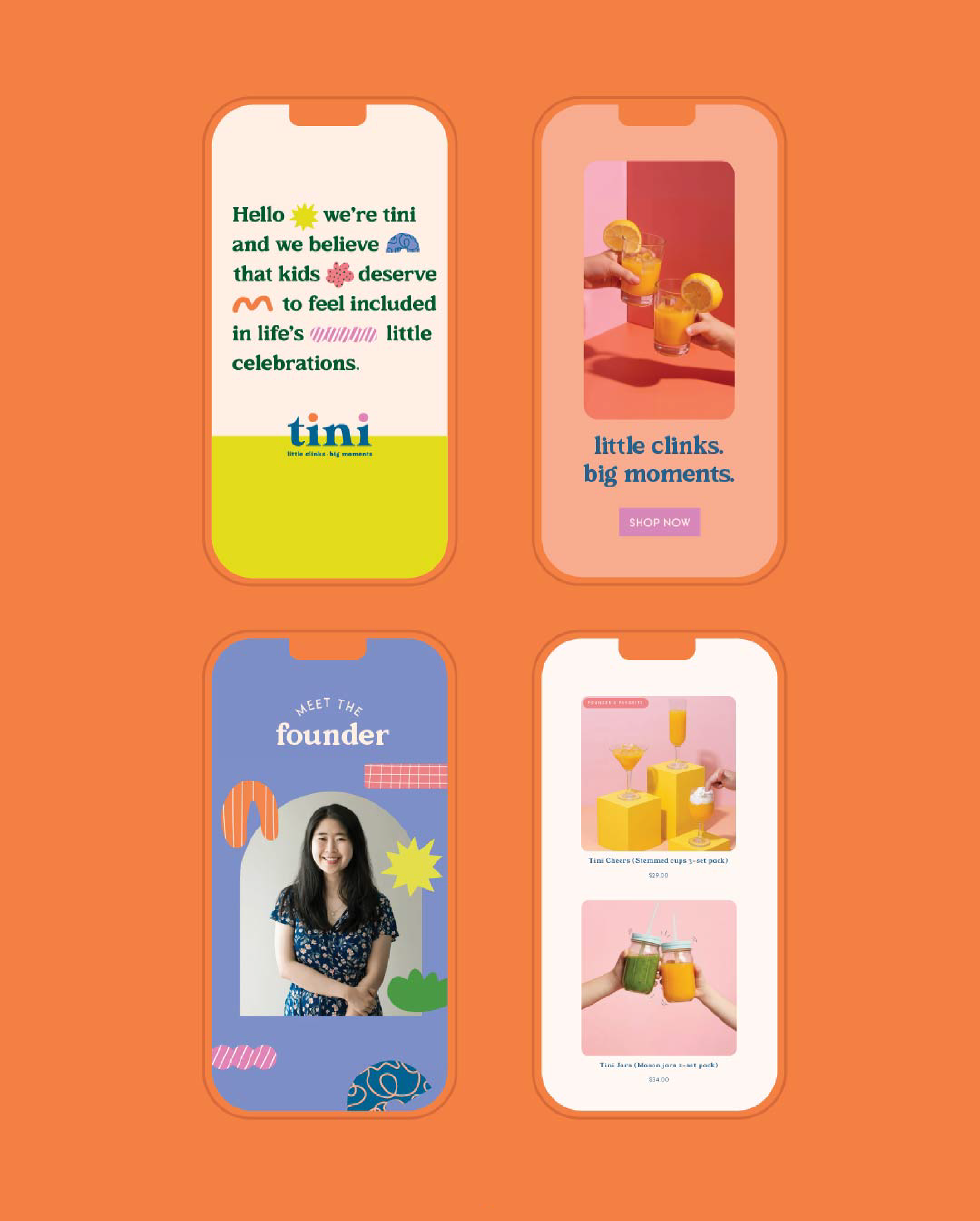
I created an identity that brings together the playfulness of childhood with the considered design that appeals to parents. It needed to feel joyful and full of personality without becoming overly childish, creating a brand that could sit beautifully on the family table while making children feel part of the moment.
Tini
Project Scope: Brand Strategy · Brand Identity · Illustration · Social Media Templates

A place at the table
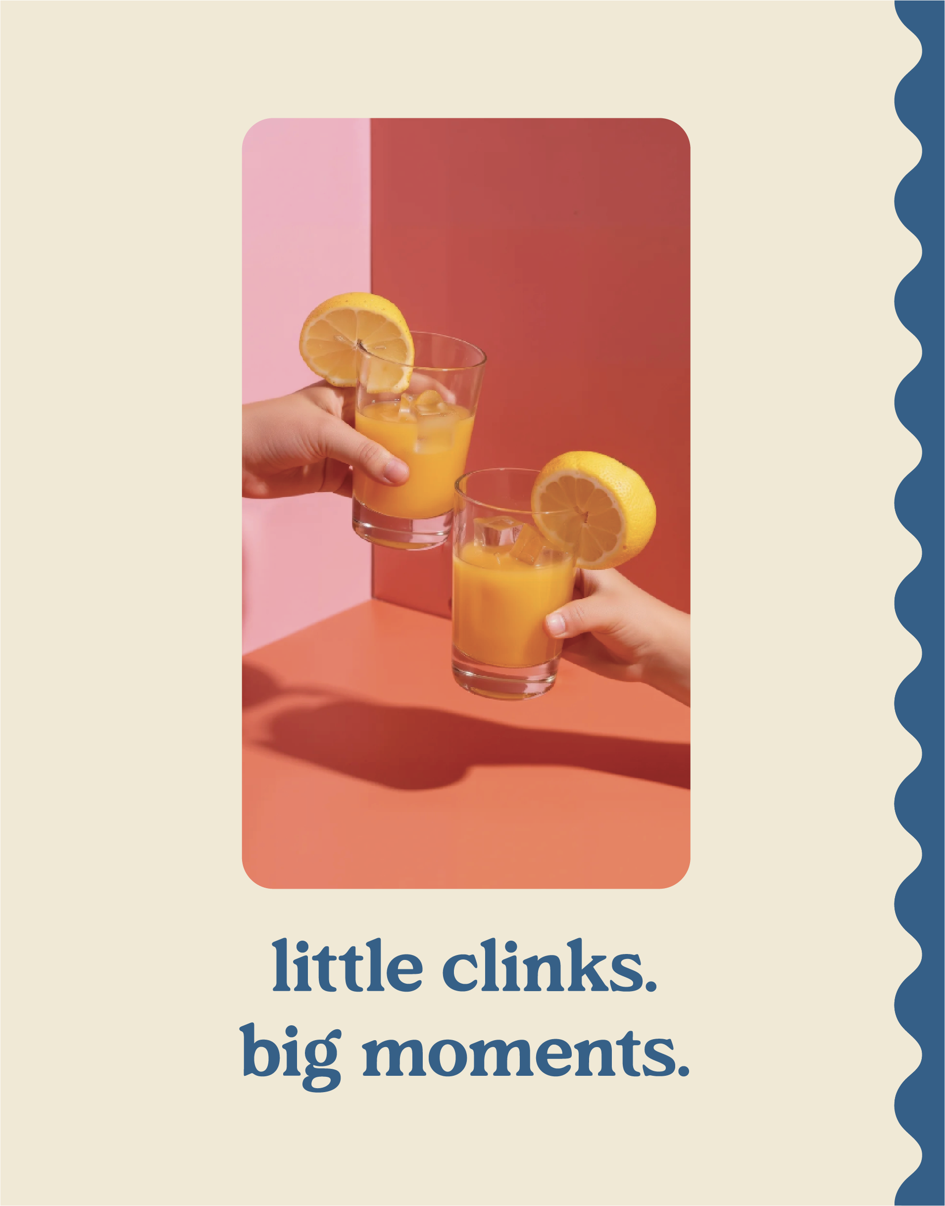
At the heart of Tini is connection. The product might be a cup, but the idea behind it is much bigger: helping children take part in the rituals that become family memories. That thinking gave us a clear emotional centre for the brand and became the foundation for the line, little clinks, big moments.
It also shaped how the identity needed to feel. Tini sits between two worlds, capturing the imagination of children while still feeling at home with design-conscious parents. The visual direction balances playful, organic forms with a more polished design sensibility, allowing childhood creativity to come through without losing the sense of quality behind the product.
That balance became part of Tini’s character. The brand could feel grown-up enough to sit proudly on a beautifully set table, while still making it very clear who these little glasses belong to. Rather than asking children to fit into an adult world, Tini gives them their own place within it, celebrating the idea that even the smallest clink can be part of something meaningful.

Kind words from the client
Building the brand
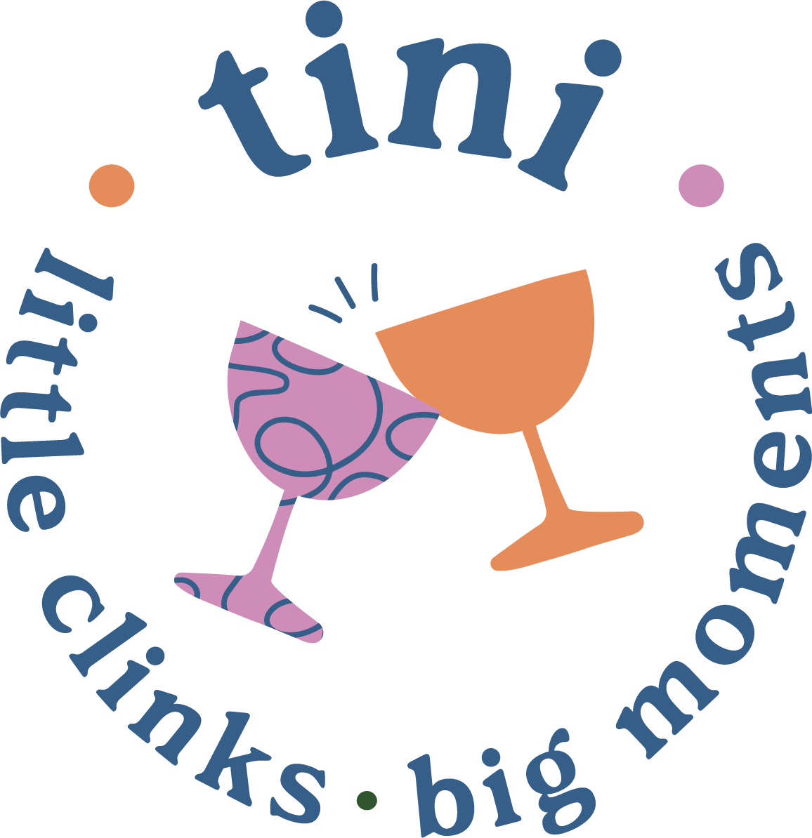
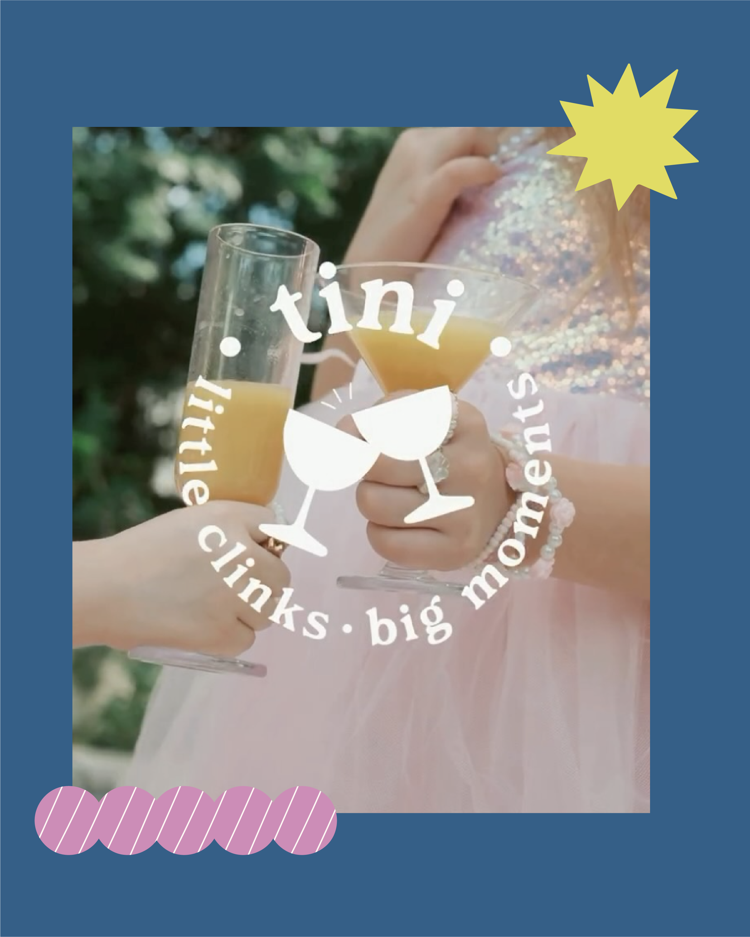
The identity was designed around that balance of play and thoughtful design. A confident primary wordmark creates a strong foundation, while the wider logo suite introduces more expressive moments, including two Tini-sized glasses captured mid-clink. Together, the marks give the brand room to shift between quieter applications and moments where it can lean further into celebration and storytelling.
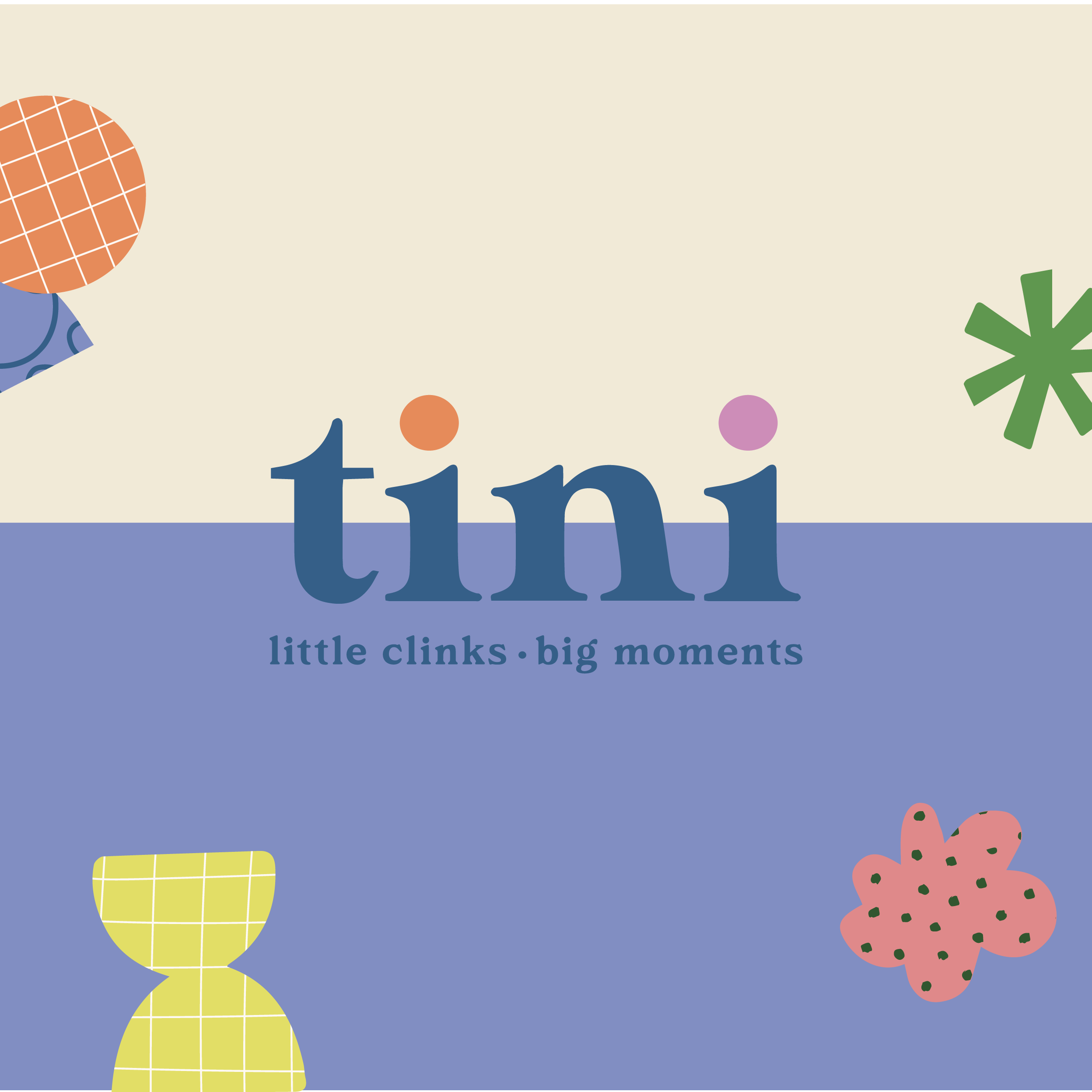
Illustration gives Tini another way to express what the brand stands for. A set of bespoke icons translates ideas such as inclusion and connection into simple visual symbols, while the wider library takes its cues from childhood creativity. Organic shapes and imperfect patterns feel as though they could have been cut, drawn or painted by little hands, bringing warmth and movement into the identity without overwhelming it.
Together, those elements create a brand world that feels considered enough for the grown-ups choosing the product and playful enough to belong to the children using it. Most importantly, the identity keeps returning to the reason Tini exists in the first place: making little hands feel part of big moments.